Learn how you can automatically generate documents from forms using MergeOS' new Web Forms feature.
Web forms are one of the easiest ways to get data into your MergeOS projects so that you can quickly generate documents. MergeOS automatically created a web form for each of your data tables so you can get started automating documents right away. You can embed the forms on your website or use them from within MergeOS.
A quick overview of web forms
MergeOS uses data tables to organise the information that you merge into documents. A data table has columns and rows and each column has a name and a type. "Types" define the type of data that is stored in a specific column, such as Plain Text, an Email, a Date or a Number. Web forms provide a quick and easy way for you to enter data into your data tables so that MergeOS can generate documents from it. A web form in MergeOS saves data to a data table. Web forms have one field for each of the columns in its related data table. You can customise how those fields are displayed within the form, and change other display settings of the form.
Creating and customising Web Forms
MergeOS created a new web form every time you make a new data table. Appropriate form fields will be chosen for each column so that the form can be used right away. You may, however, want to customise the form or make a completely different one, and we've made this really easy to do. This section discusses all the options you have when creating or editing a web form.
Creating a new Form
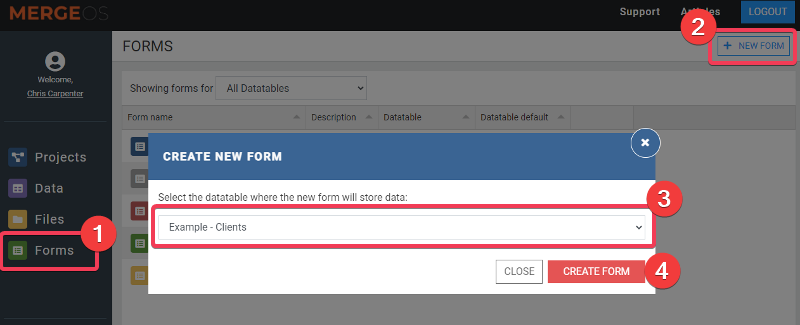
As mentioned in the previous section, MergeOS will automatically create a Form whenever you create a Data Table. You can find all your existing forms using the Form link in the left menu. You can, however, create more than one form for a data table and this can be done using the New Form button on the same page. Creating a new form
Click on the Forms menu item
Click on the "New Form" button in the top menu
Choose the datatable you want the form to send data to
Click on Create Form
Your new form will be created with the default form fields and you will be taken to the form editing page.
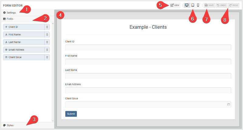
Editing a Form
The form editor is where you can make changes to your web forms. On the left are three menu items that open up when you click them. In the middle is a preview of how the form will look. This updates as you make changes.
Editing a form
Settings - This is where you name & describe your form, and configure what happens after it is submitted.
Fields - All of the fields are listed here. Click to open each field and modify its settings.
Styles - Here you can change the colours, fonts and sizes of different elements within the form.
Preview - This shows how the form will look with the changes you make.
View Button - Click to open the saved form into a new window. This is fully functional and will save records.
Preview Sizes - Click to view the form as it would look on Desktop, Tablet or Phone.
Save - Click to save your form. Save is only enabled when you have unsaved changes.
Undo/Redo - Click to undo or redo any of the changes you have made.
Form Settings
Click on Settings to open the form settings section. Below we describe each of the settings:
Data table Displays the name of the data table this form saves records to.
Webform Name The internal name of the form that shows only in the admin pages.
Webform Description An internal description for the webform that shows only in the admin pages.
Public Title The title that appears at the top of the form.
Public Description Descriptive text that appears below the public title.
Submit Button Text The words that appear within the submit button.
Active Only active forms can be used to submit new records.
Post Submission Action Choose if you want to display a simple text message when the form is submitted or redirect the user to a different URL.
Thank you text Only available if Post Submission Action = Display Text Type the text that you would like to display when a form is submitted.
Redirect URL Only available if Post Submission Action = Redirect to URL Enter the full URL of the page you would like to redirect to. The page the form is on will redirect on a successful submission.
Generate & download document after submit Only available if Post Submission Action = Display Text Choose if you would like to generate the document immediately and provide a download link to the user who submitted the form.
Project to generate Only available if Post Submission Action equals Display Text and Generate & download document after submit equals yes. Select the project that you would like to use to generate the document. A datatable can belong to multiple projects, so this lets you define which one will be used for this particular form. Please note that projects must be started/running to display in the dropdown.
File Type Only available if Post Submission Action equals Display Text and Generate & download document after submit equals yes. Select the file types that you would like to offer the user for download. Only file types generated from the chosen project will be available. For example, if your project is only generating a PDF file, then only PDF will be available.
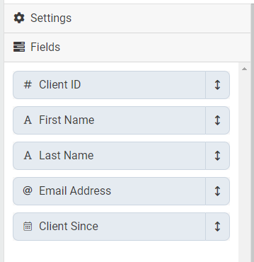
Form Fields
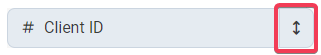
Click on the Fields heading to show the form fields available in the form. The fields are displayed using the name and type of the column in the data table. Click on a field to see its settings. Form Fields Changing Field Order To move a field within a form, click and drag on the arrow within the Field heading. Click and drag to change field order
Field Settings
These settings will be found across all field types.
Label This is the label or question that you want to display on the form for this field.
Form Field Type Every field will have a field type, which defines how the field looks and works. This is described in more detail in the Field Types section below.
Placeholder The placeholder is text that appears in the field to give the user a hint as to what type of data to enter. It is never saved to the datatable.
Visible Fields are visible by default. You can hide a field by setting this to No.
Required You can make a field required by setting this to Yes.
Desktop Width / Tablet Width / Phone Width By default, each field takes up 100% of the form width. You can set each field to take up a smaller percentage of the screen width using these settings. Fields will flow into the same row when there combined width is less than or equal to 100%. For example, say you wanted two fields next to each other when viewed on a wide screen. You would set them both to 50% on desktop, and they would flow into the same row. However, if the form was viewed on a smaller screen, they would then take the 100% width from the Tablet setting.
Desktop widths are used on screen widths greater than 992 pixels. Tablet widths are used when the screen is less 992 pixels. Phone widths will take effect when the screen is less than 768 pixels.
Data Types and Field Types
Each field in the form is mapped to a specific column of the data table the form is linked to. Each of these columns has a data type and each data type has a range of field types you can choose:
Plain Text - Single Line Text Box, Multi-line text box, Unique Identifier, Drop Down
Email Address - Email Text Box
Number - Number Text Box
Date - Date Picker, Date/Time Picker
True/False - Toggle Field
Item List - Multi-select
NUMBER FIELDS Form Field Type Number fields only have one option - Number
Number Type - Decimal or Integer Choose whether the field should accept Decimal numbers or just integers.
Min Value Only numbers greater than or equal to this value can be entered into the field.
Max Value Only numbers equal to or greater than this value can be entered into the field.